


Client
Media Company / Back-End Systems / Business Marketing ¨CHANGO MEDIA¨
Project
Logo design, Brand Identity
Location
Caerphilly - United Kingdom
Design
Edwin Correa, Stamina Creative Studio

Graphic construction
The design of the Chango Media logo stands out for the careful selection of dimensions, ensuring that the gorilla image is striking and recognizable at different scales. The strategic position and size guarantee readability and sharpness, preserving the distinctive identity of Chango Media in various contexts.


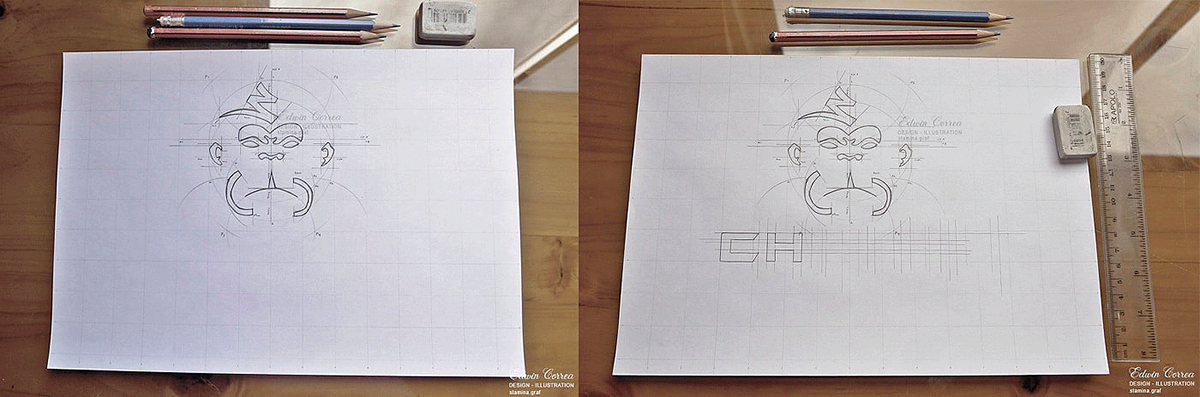


The sketch for Chango Media is a conceptual exercise that merges power, reflection, and professional aesthetics. Each element has been precisely considered to convey the unique identity and communicative power of Chango Media in a dynamic and visually demanding market.

The Chango Media logo stands as a testament to precise design, where the gorilla's face becomes a distinctive symbol embodying the strength, expression, and unique identity of the brand in the competitive media landscape.

Gold: Represents prestige and quality.
Red: Adds vitality and dynamism.
Black: Conveys elegance and seriousness.
The combination of gold, red, and black not only communicates a harmonious visual aesthetic but also reflects the uniqueness, power, and quality that define Chango Media's identity in the media sector. This set of corporate colors stands as a distinctive and professional visual statement in the market.

Positive:
The positive version of the Chango Media logo highlights the harmonious combination of gold, red, and black, infusing vitality, prestige, and elegance. Gold shines with a sense of excellence, while red brings dynamism and strength. Black provides a solid and balanced background, symbolizing the seriousness and reliability of Chango Media in the media realm. In this version, the color palette collaborates to create a distinctive and memorable visual identity.
Negative:
The negative version of the logo elegantly adapts to dark backgrounds or black and white situations. In this representation, gold retains its glow, red maintains its vitality, and black continues to provide a solid contrast.
This negative design ensures that the logo's identity and readability remain strong in various applications and environments, preserving Chango Media's visual consistency without compromising its impact and professionalism.

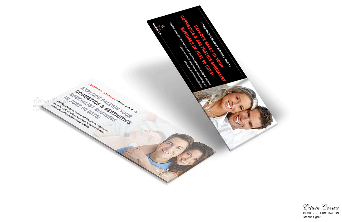
Chango Media social media banners not only meet professional design standards but also provide a captivating and coherent visual expression that reflects the brand's unique essence and strength in the media universe.
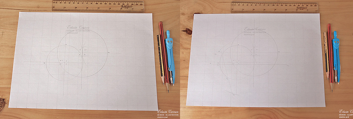
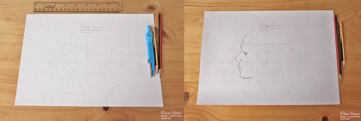


The sketch of the human head as a conceptual map for Chango Media encapsulates the complexity and richness of the brand, offering a professional and artistic visual representation that communicates the breadth and depth of the services provided in the media field.


Copyright ©
The images displayed on this BEHANCE network are entirely my creation, by 'Edwin Correa / Stamina Creative Studio,' and they come with tracking codes or pixels, which are protected by all applicable laws and regulations for this project. Therefore, if they are used or published without my permission or rights, it will be subject to penalties under the full force of the law, whether national or international.


